Every successful digital product lives or dies by one critical screen — its core app dashboard. Whether you’re building a SaaS platform, a mobile application, or an enterprise business tool, the dashboard is where users spend most of their time, make their most important decisions, and form their lasting impressions of your product. A well-designed core app dashboard doesn’t just display data; it drives action, reduces friction, and directly impacts retention.
In this complete guide, you’ll learn exactly what a core app dashboard is, what features it must include, how to design one from scratch, common mistakes to avoid, and how the world’s leading products approach dashboard UI.
What Is a Core App Dashboard?
A core app dashboard is the central interface of a software application that aggregates, visualizes, and presents the most critical data and controls a user needs to operate the product effectively. It serves as the operational hub — the first screen users see after logging in, and the one they return to most frequently throughout their session.
Unlike supplementary pages or settings screens, a core app dashboard is purpose-built for decision-making and overview. It surfaces key metrics, real-time activity, navigation shortcuts, and personalized insights all in one place, eliminating the need for users to hunt through multiple screens to understand what’s happening in their account or workflow.
For SaaS products in particular, the dashboard is a retention engine. When users immediately see the value your product delivers — through clear metrics, progress indicators, and actionable alerts — they are far more likely to stay engaged, upgrade, and refer others. A poor dashboard design, conversely, is one of the leading causes of early churn.
Key Features of a Core App Dashboard
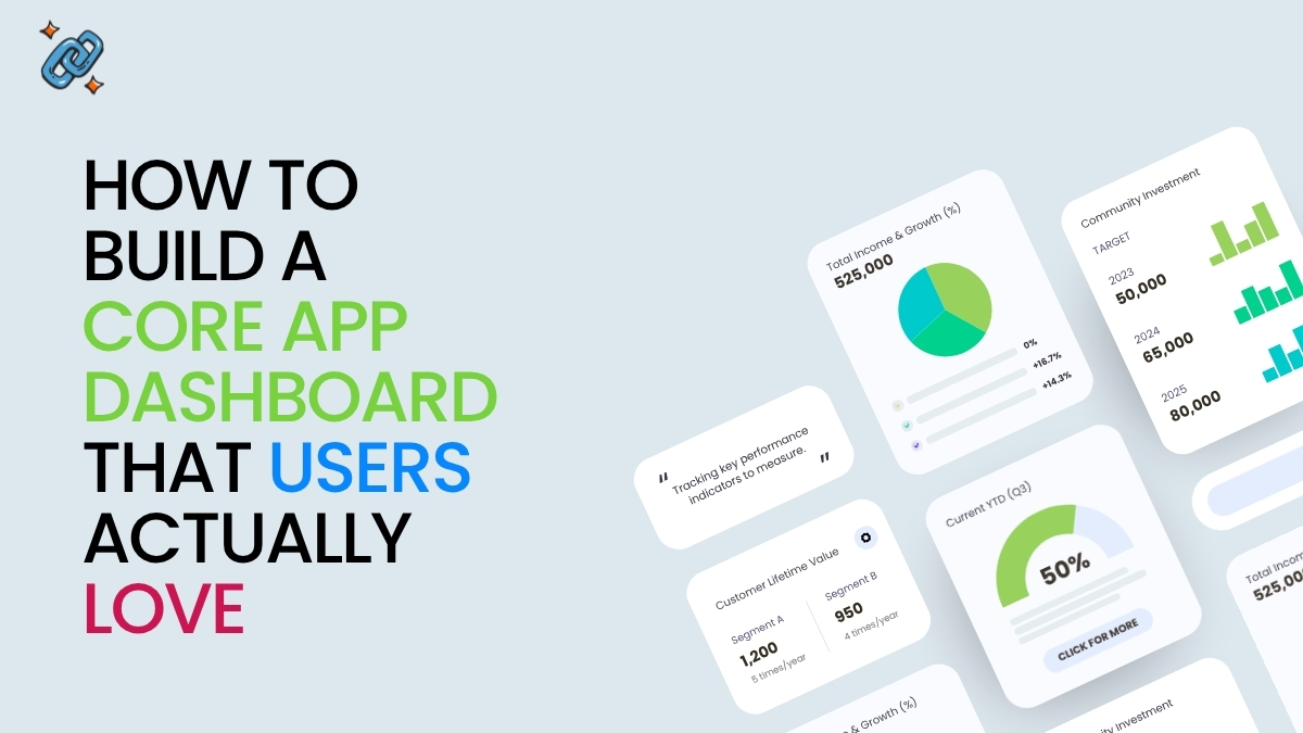
1. Analytics Overview Panel
The analytics overview is the heartbeat of any dashboard. It presents high-level KPIs — such as revenue, active users, conversions, or task completion rates — in a scannable format, typically using cards, charts, or summary widgets. The goal is to answer the question “how are things going?” within seconds of opening the dashboard.
Effective analytics panels use progressive disclosure: a headline number accompanied by a trend indicator (up/down vs. last period) and a sparkline or mini-chart. This allows experienced users to get the answer at a glance, while curious users can drill down for more detail.
2. User Activity Tracking
Activity feeds and usage logs give users and administrators a real-time understanding of what’s happening inside the product. For admin dashboards, this might mean seeing which team members are active, what actions they’ve taken, or where they’re encountering errors. For user-facing dashboards, it typically surfaces recent actions, completed tasks, or milestones reached.
Activity tracking also serves a powerful psychological function: it makes the product feel alive and responsive, reinforcing the user’s sense of progress and momentum.
3. Navigation Panel
The navigation panel is the structural skeleton of any dashboard UI. It provides persistent, context-aware access to all major sections of the application. Sidebar navigation is the most common pattern for desktop apps, while tab bars dominate mobile dashboard design.
Great navigation panels are hierarchical without being cluttered. They surface the top 5–7 destinations users visit most, group related sections logically, and use clear iconography paired with labels — never icons alone, which force users to guess.
4. Custom Widgets and Modules
Not all users care about the same data. Custom widgets allow users to personalize their dashboard by adding, removing, resizing, or rearranging modules based on their workflow. This transforms a static screen into a dynamic workspace.
Leading SaaS products like Salesforce, HubSpot, and Notion have built entire ecosystems around customizable dashboard modules, because personalization dramatically increases engagement. When users feel ownership over their workspace, they use it more.
5. Notifications and Alerts
A core app dashboard must surface time-sensitive information without creating noise. Notifications fall into two categories: passive alerts (informational banners, badge counts) and active alerts (modal warnings, inline errors). The best dashboard UX uses a clear priority hierarchy — critical alerts appear prominently, routine updates are accessible but unobtrusive.
Notification design is where many dashboards fail. Flooding users with low-priority alerts trains them to ignore everything, including the critical ones. Ruthless prioritization is essential.
6. Integrations Hub
Modern users operate across many tools — CRMs, communication platforms, billing systems, analytics providers. A core app dashboard that integrates with these external services becomes significantly stickier. Integration panels typically show connection status, sync timestamps, and quick-action shortcuts, creating a unified command center for the user’s entire workflow.
Types of Core App Dashboards
Admin Dashboard
An admin dashboard is designed for super-users, product managers, or system administrators. It prioritizes system-wide visibility: user management, billing data, permission controls, audit logs, and operational health metrics. Admin dashboards typically feature more data density and more complex table-based layouts than user-facing dashboards.
User Dashboard
The user dashboard is the most personal type. It presents data and tools specific to the individual user’s account, progress, and goals. Onboarding checklists, personal analytics, recent activity, and quick-action shortcuts are all common components. The primary design goal here is making the individual feel productive and informed immediately.
Analytics Dashboard
An analytics dashboard is purpose-built for data exploration and reporting. It features interactive charts, filterable date ranges, comparison views, and export functionality. These dashboards are common in marketing platforms, BI tools, and product analytics suites. The primary design challenge is presenting complex, multi-dimensional data without overwhelming the user.
SaaS Dashboard
The SaaS dashboard is a broader category that often combines elements of the three above. A well-designed SaaS dashboard is the primary retention tool in the product — it must demonstrate value on every visit. The most successful SaaS dashboards are opinionated: they make decisions about what to show by default, based on deep understanding of the user’s core job-to-be-done.
How to Design a Core App Dashboard: Step-by-Step
Step 1: Define User Goals
Before opening a design tool, spend time with your users. What decisions do they need to make from the dashboard? What questions does it need to answer? What actions should be one click away? These questions define the purpose of every element on the screen.
User research techniques — jobs-to-be-done interviews, session recordings, and support ticket analysis — are invaluable at this stage. Resist the urge to show everything; instead, design for the 20% of features that drive 80% of value.
Step 2: Choose Key Metrics
With user goals defined, select the 3–7 metrics that most directly reflect whether users are achieving those goals. For a project management tool, this might be tasks completed, deadlines approaching, and team velocity. For an e-commerce platform, it could be daily revenue, conversion rate, and cart abandonment.
Every metric on your dashboard should be actionable — meaning the user can take a specific action in response to what they see. Vanity metrics that look good but don’t drive decisions are dashboard clutter.
Step 3: Define the Layout Structure
Dashboard layout should follow the F-pattern or Z-pattern of visual scanning — the most critical information belongs in the top-left, with supporting information flowing right and down. Use a grid system (typically 12 columns) to create predictable, responsive layouts.
A proven three-zone structure works for most dashboards: a top summary bar (headline KPIs), a main content area (charts, tables, activity feeds), and a sidebar or right panel (notifications, quick actions, integrations). This structure scales from simple to complex without breaking usability.
Step 4: Apply UI/UX Principles
Hierarchy: Size and weight guide the eye. Your most important number should be the largest element on the screen.
Whitespace: Cramped dashboards are cognitively exhausting. Generous padding between modules reduces visual noise and makes each component feel distinct and scannable.
Color with purpose: Use color to encode meaning — green for positive trends, red for alerts, neutral grays for supporting data. Avoid decorative color that adds visual complexity without communicating information.
Typography: Use a maximum of two typefaces and three font sizes. Label every data point clearly. Never make users wonder what a number represents.
Step 5: Ensure Mobile Responsiveness
A dashboard that only works on desktop is no longer acceptable. Mobile dashboard design requires deliberate prioritization: you cannot fit a 12-column desktop layout onto a 375px screen. Instead, redesign for mobile from the ground up.
Best practices for mobile dashboard UI include stacking cards vertically, using bottom tab navigation, collapsing charts into summary numbers with drill-down access, and ensuring all tap targets meet the 44px minimum size requirement. Progressive disclosure — showing high-level summaries with expandable details — is the cornerstone of good mobile dashboard UX.
Best Practices for Core App Dashboard Design
Embrace Simplicity Over Completeness. The instinct to add more — more metrics, more widgets, more alerts — is one of the most common and destructive forces in dashboard design. Every addition increases cognitive load. The best dashboards are not the ones that show everything; they’re the ones that show exactly the right things, nothing more.
Establish a Clear Data Hierarchy. Not all data is equal. Establish a visual hierarchy that communicates importance at a glance. Primary KPIs dominate the top of the screen. Secondary metrics support them. Tertiary data is accessible but not prominent. This hierarchy should be so clear that a new user can orient themselves within five seconds.
Implement Real-Time Updates Thoughtfully. Live data creates a sense of immediacy, but real-time updates can also be disruptive. Use polling intervals or WebSocket connections to update dashboard data in the background, and use subtle visual cues (a soft flash, a timestamp update) rather than jarring reloads. For high-stakes metrics like server health or live sales, real-time is essential. For historical reports, it adds complexity without benefit.
Design for Personalization. Give users meaningful control over their dashboard experience: the ability to pin favorite reports, hide irrelevant modules, set threshold-based alerts, and choose their default view. Personalization increases engagement because it creates ownership. Users who have configured their dashboard to match their workflow are far less likely to churn.
Real-World Core App Dashboard Examples
Stripe Dashboard (SaaS/Fintech): Stripe’s dashboard is a masterclass in information architecture. The homepage surfaces revenue trends, recent payments, and key alerts without overwhelming the user. Data is presented in clean tables with smart defaults, and every number links to a detailed drill-down view. It serves both first-time users and power users without compromising either experience.
Linear (Project Management SaaS): Linear’s dashboard demonstrates how to handle high-density data with elegance. Its sidebar navigation is persistent and well-organized, its issue views are keyboard-navigable, and its progress indicators make team velocity immediately visible. Linear has become the benchmark for B2B SaaS dashboard UI.
Apple Health (Mobile App): Apple Health shows how a core app dashboard can work on a small screen without sacrificing depth. The Summary tab intelligently surfaces the metrics most relevant to the individual user based on their history, while preserving full access to all data through clear drill-down paths.
HubSpot CRM Dashboard (Business Platform): HubSpot’s sales dashboard demonstrates the power of role-specific views. Sales reps see their pipeline, activity quota, and upcoming tasks. Managers see team performance and forecasts. Same platform, radically different dashboards — both optimized for their user’s specific job.
Notion (Productivity SaaS): Notion’s home dashboard blurs the line between dashboard and workspace, allowing full customization through database views, linked pages, and embedded widgets. It represents the far end of the personalization spectrum — powerful but requiring more user investment to configure.
Benefits of a Well-Designed Core App Dashboard
Better Decision-Making. When the right data is surfaced at the right time in the right format, users make faster, more confident decisions. A well-designed dashboard reduces the cognitive work required to understand a situation, freeing mental bandwidth for action.
Improved User Experience and Retention. The dashboard is the product. Users who find immediate value in their dashboard — who log in and immediately understand their situation and know their next action — stick around. Dashboards are one of the highest-leverage areas for improving activation and retention metrics.
Operational Efficiency. A great dashboard eliminates the need for status meetings, manual reporting, and context-switching between tools. When everyone on the team can see the same real-time picture of what’s happening, communication overhead drops and execution speed increases.
Common Dashboard Design Mistakes to Avoid
1. Dashboard overload. Trying to show every possible metric results in a wall of numbers that communicates nothing. Prioritize ruthlessly.
2. No clear visual hierarchy. When everything is the same size and weight, nothing is important. Use size, color, and spacing intentionally to guide the eye.
3. Ignoring mobile users. Designing desktop-first and treating mobile as an afterthought produces broken experiences on the devices many users rely on exclusively.
4. Vanity metrics without context. Raw numbers without benchmarks, trends, or targets are nearly meaningless. Always pair data with context: vs. last period, vs. goal, vs. industry average.
5. No empty states. New users with no data see a broken-looking dashboard full of zeros and empty charts. Design meaningful empty states that guide users toward the actions that will populate their dashboard.
6. Inconsistent design language. Mixing chart libraries, color schemes, and interaction patterns across the dashboard creates a disjointed experience that erodes trust in the product.
7. Neglecting performance. A dashboard that takes four seconds to load will be avoided. Optimize queries, implement smart caching, and show skeleton loaders while data fetches. A fast dashboard feels like a capable product.
Frequently Asked Questions
What is a core app dashboard?
A core app dashboard is the primary interface of a software application where users access key metrics, navigation, activity data, and controls in one centralized view. It serves as the operational hub of the product, designed to help users understand their situation and take meaningful action quickly.
What should a dashboard include?
At minimum, a dashboard should include a KPI summary panel, navigation to major app sections, user activity data, notifications, and quick-access actions. The specific components depend entirely on the user’s goals and the product’s core value proposition. Features like custom widgets, integrations, and advanced analytics can be added as complexity grows.
How do you design a core app dashboard?
Start by defining user goals through research, then select the 3–7 metrics that most directly reflect progress toward those goals. Design a clear layout structure using grid systems and visual hierarchy principles, apply UI/UX best practices around typography, color, and whitespace, and ensure the design is fully responsive for mobile users. Test with real users early and iterate based on behavioral data.
What tools can you use to build a dashboard?
For design and prototyping: Figma, Sketch, and Adobe XD. For frontend development: React with charting libraries such as Recharts, Chart.js, or D3.js. For no-code/low-code dashboards: Retool, Metabase, or Tableau. For embedded analytics: Mixpanel, Amplitude, or Looker. The right stack depends on your technical resources and customization requirements.
What is the difference between an admin dashboard and a user dashboard?
An admin dashboard is designed for system administrators or managers and prioritizes system-wide visibility, user management, and operational controls. A user dashboard is personalized to an individual user and emphasizes their own data, tasks, and goals. Most SaaS products need both, with clearly differentiated designs for each role.
How do I make my dashboard mobile-friendly?
Design for mobile separately from desktop, not as an afterthought. Stack cards vertically, use bottom navigation bars, collapse charts into summary numbers with expandable details, ensure tap targets are at least 44px, and use responsive grid systems. Test on real devices, not just browser emulators, and prioritize the 2–3 most critical features for the mobile view.
How do I prevent dashboard overload?
Apply a strict prioritization framework: ask “what decision does this metric help the user make?” for every element. If the answer is unclear, remove it. Implement progressive disclosure — show high-level summaries by default and reserve detailed data for drill-down views. Involve real users in the prioritization process through testing and feedback sessions.
How do real-time updates affect dashboard performance?
Real-time updates add significant technical complexity. Use WebSockets for truly live data (e.g., transaction feeds, system health) and scheduled polling (every 30–60 seconds) for metrics that don’t require millisecond precision. Implement skeleton loaders and optimistic UI patterns to keep the dashboard feeling fast even when data is loading.
Conclusion
A great core app dashboard is not built in a single sprint — it’s refined continuously through deep user understanding, disciplined prioritization, and relentless attention to detail. The most successful SaaS products treat their dashboard as a product in itself: one with its own roadmap, its own success metrics, and its own dedicated design focus.
Start with user goals, not features. Choose metrics that drive decisions, not metrics that look impressive. Design for clarity, then complexity — never the reverse. Test with real users, measure the right things (time-to-insight, task completion rate, session depth), and iterate without attachment to your initial design decisions.
The teams that invest seriously in dashboard UI are the teams that win on retention, expansion revenue, and long-term user loyalty. Your dashboard is your product’s handshake — make sure it’s a strong one.

Abdullah Zulfiqar is Co-founder and Client Success Manager at RankWithLinks, an SEO agency helping businesses grow online. He specializes in client relations and SEO strategy, driving measurable results and maximizing ROI through effective link-building and digital marketing solutions.
Abdullah Zulfiqar
<strong>Abdullah Zulfiqar</strong> is Co-founder and Client Success Manager at <strong>RankWithLinks</strong>, an SEO agency helping businesses grow online. He specializes in client relations and SEO strategy, driving measurable results and maximizing ROI through effective link-building and digital marketing solutions.
