
Most presentations fail before the speaker says a single word. The visuals are cluttered, the slides are text-heavy, and the design looks like it was thrown together the night before. Audiences tune out within minutes — not because the content is bad, but because the visuals make it hard to stay engaged.
Learning how to create visuals for presentations is one of the highest-leverage skills you can develop as a professional, educator, or communicator. Strong visuals do not just make your slides look better. They make your ideas land harder, your message stick longer, and your audience trust you more.
This guide walks you through everything you need to know — from foundational design principles to practical tools and step-by-step techniques — so you can create presentation visuals that genuinely move people.
Why Visuals Matter More Than Most Presenters Realize
The human brain processes visual information roughly sixty thousand times faster than text. When you put a wall of bullet points on a slide, your audience reads ahead, loses the thread of what you are saying, and mentally checks out.
When you replace that wall of text with a clear, well-designed visual, something different happens. The image and your words work together. The audience listens and understands simultaneously rather than choosing between the two.
Strong presentation visuals:
- Increase audience retention of key information significantly
- Make complex data and concepts easier to understand at a glance
- Build credibility and professionalism instantly
- Keep energy and attention levels higher throughout the presentation
- Reinforce your spoken message rather than competing with it
The goal of every visual you create is to support what you are saying — not replace it, not repeat it word for word, and not distract from it.
The Core Principles of Effective Presentation Design
Before diving into tools and techniques, understanding a few foundational design principles will transform everything you create.
1. Simplicity Over Complexity
The most common mistake presenters make is trying to put too much on a single slide. Every element you add competes for attention. Every extra word dilutes the impact of the ones that matter.
A good rule of thumb — if you can remove something from a slide without losing the core message, remove it.
One idea per slide is not a limitation. It is a superpower.
2. Visual Hierarchy
Visual hierarchy is the principle of arranging elements so the most important information is seen first. It guides the audience’s eye through your slide in the order you intend.
You create hierarchy through:
- Size — Larger elements draw the eye first
- Color — High contrast elements stand out against muted backgrounds
- Position — Elements at the top or center are seen before those at the edges
- Weight — Bold text draws attention before regular weight text
Every slide should have one dominant element that anchors the viewer’s attention before anything else.
3. Consistent Visual Language
Consistency across your slides creates a sense of professionalism and intentionality. When fonts, colors, spacing, and layout vary randomly from slide to slide, the presentation feels chaotic even if the content is strong.
Decide on your visual system before you start building:
- Two fonts maximum — one for headings, one for body text
- A color palette of three to five colors used consistently throughout
- Consistent slide margins and spacing
- A repeating layout structure that varies only when needed for emphasis
4. White Space Is Not Wasted Space
Empty space on a slide is not a problem to solve. It is a design tool. White space gives your content room to breathe, directs attention to what matters, and makes your slides feel calm and professional rather than cramped and overwhelming.
Resist the urge to fill every corner of the slide. The empty space is doing real work.
5. Contrast and Readability
Your audience needs to be able to read your slides from the back of the room. That means strong contrast between text and background, font sizes that are large enough to be legible at a distance, and color combinations that do not strain the eyes.
Dark text on a light background or light text on a dark background both work well. Never use light text on a light background or dark text on a dark background regardless of how it looks on your laptop screen.
Types of Visuals You Can Use in Presentations
Different types of visuals serve different purposes. Knowing which type to use in which situation is just as important as knowing how to design them well.
Data Visualizations and Charts
When you need to communicate numbers, trends, or comparisons, a well-designed chart is almost always more effective than a table of figures.
Common chart types and when to use them:
- Bar charts — Comparing values across categories
- Line charts — Showing trends over time
- Pie charts — Showing proportions of a whole (use sparingly and only with a small number of segments)
- Scatter plots — Showing relationships between two variables
- Area charts — Showing cumulative totals over time
The golden rule of data visualization — simplify ruthlessly. Remove gridlines, legends, and labels that do not add meaning. Let the data speak without visual clutter getting in the way.
Icons and Illustrations
Icons are one of the most underused visual tools in presentations. A well-chosen icon communicates an idea instantly and adds visual interest without adding complexity.
Use icons to:
- Represent categories or sections of your presentation
- Replace text labels in lists and diagrams
- Add visual rhythm and breathing room to text-heavy slides
- Guide the audience’s eye through a process or flow
Illustrations work similarly but add warmth and personality. They are particularly effective in presentations aimed at creative, consumer, or educational audiences.
Photography
A single powerful photograph can convey emotion, context, and atmosphere in a way that no amount of text ever could.
Best practices for using photos in presentations:
- Use full-bleed images that fill the entire slide for maximum impact
- Choose images that are thematically relevant, not just decorative
- Overlay text on a semi-transparent dark or light panel rather than directly on the image
- Use high-resolution images only — pixelated photos destroy credibility instantly
- Use high-resolution images only — and if a photo isn’t sharp enough, enhance it with PicsArt AI Image Enhancer, since pixelated visuals instantly damage credibility.
- Stick to a consistent photographic style across your deck
Avoid generic stock photography that looks staged or artificial. Authentic, real-world imagery resonates far more with modern audiences.
Diagrams and Process Flows
When you need to explain a system, a process, or a relationship between concepts, a diagram does it faster and more clearly than paragraphs of explanation.
Common diagram types for presentations:
- Flowcharts — Step by step processes with decision points
- Timelines — Chronological sequences of events or milestones
- Venn diagrams — Overlapping relationships between concepts
- Org charts — Hierarchical structures and reporting relationships
- Cycle diagrams — Repeating processes or feedback loops
Keep diagrams clean and uncluttered. Use arrows sparingly and make sure the flow direction is obvious at a glance.
Text-Based Visuals
Sometimes the most powerful visual on a slide is a single bold statement, a striking statistic, or a short quote displayed with strong typographic treatment.
A slide that shows nothing but the number 73% in large bold text alongside a single explanatory line can be more impactful than a full chart. A well-attributed quote in large type can stop an audience in their tracks.
Do not underestimate the power of typography as a visual tool in its own right.
Step-by-Step Process for Creating Presentation Visuals
Step 1: Start With the Message, Not the Design
Before you open any design tool, write out the core message of each slide in plain language. What is the single most important thing this slide needs to communicate?
Once you know the message, ask yourself — what is the best visual way to express this? Is it a chart, an image, a diagram, or a bold statement?
Design follows message. Never the other way around.
Step 2: Sketch Before You Build
Spend five minutes sketching rough layouts on paper before touching your presentation software. This sounds old-fashioned but it saves enormous amounts of time.
When you sketch first, you make layout decisions quickly and cheaply. You avoid spending an hour building a slide only to realize the structure does not work.
Even rough, messy sketches are enough to give you a clear direction before you start building.
Step 3: Choose Your Visual Style and Stick to It
Decide on the overall visual style of your presentation before you build the first slide. Are you going for clean and minimal? Bold and colorful? Professional and corporate? Warm and approachable?
Your style choice should match your audience, your topic, and your personal brand as a presenter. Once you choose, apply it consistently from the first slide to the last.
Step 4: Build Your Master Slide Template
In any presentation software, you can create a master slide that defines the default fonts, colors, and layout for every slide in your deck. Setting this up properly at the start saves enormous time and ensures consistency throughout.
Your master slide should define:
- Background color or image
- Heading font, size, and color
- Body font, size, and color
- Logo placement if applicable
- Consistent margins and safe zones
Build once, apply everywhere.
Step 5: Design Each Slide Around One Core Visual
With your message and style defined, build each slide around a single dominant visual element. Everything else on the slide should support that element, not compete with it.
If the dominant element is a chart, the chart should take up the majority of the slide space. If it is a photograph, let it fill the frame. If it is a bold statistic, give it room to breathe.
Resist the temptation to add supporting visuals, secondary charts, or decorative elements that dilute the focus.
To streamline this process, an ai presentation agent can help structure slides and refine visuals, ensuring clarity and stronger audience impact.
Step 6: Apply the Five-Second Test
Once a slide is built, look away and then look back at it. Within five seconds, can you identify the most important element and understand the core message?
If it takes longer than five seconds to understand what the slide is communicating, simplify further. Remove elements, increase contrast, or increase the size of the dominant visual until the message is immediately clear.
Step 7: Review the Full Deck as a Visual Story
Once all slides are built, view the entire presentation from beginning to end as a visual sequence. Ask yourself:
- Does the visual style feel consistent throughout?
- Does the pacing feel right — are there enough visual breaks?
- Does each slide transition feel logical from the one before it?
- Is there a clear visual beginning, middle, and end?
A great presentation is not just a collection of good individual slides. It is a coherent visual story that flows naturally from start to finish.
Best Tools for Creating Presentation Visuals
Choosing the right tool for the right job is half the battle. The options below are organized by purpose so you can build a focused, efficient visual toolkit rather than jumping between platforms randomly.
For Building Slides
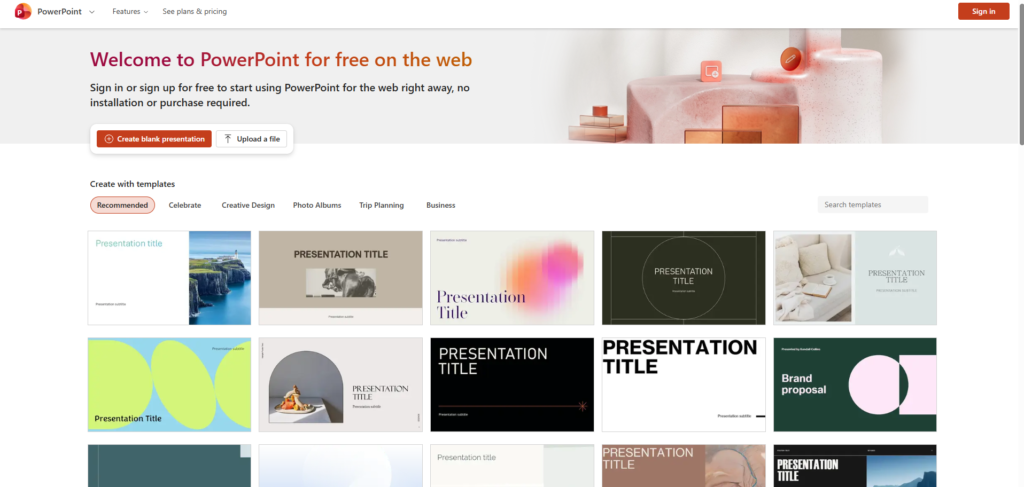
Microsoft PowerPoint remains the undisputed industry standard for corporate, academic, and enterprise presentations. Most professionals underestimate how powerful it has become. Recent versions include built-in design suggestions, morph transitions, and advanced image editing that rival dedicated design tools. If your audience expects a traditional slide deck, PowerPoint delivers reliability and compatibility no other tool matches.
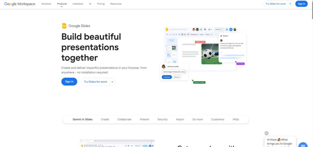
Google Slides is the go-to choice for teams that collaborate in real time or work across different devices and operating systems. Its cloud-based nature means no version conflicts, no file sending, and no compatibility headaches. It is slightly less feature-rich than PowerPoint but handles the vast majority of presentation needs with ease. The ability to embed live data from Google Sheets is a particularly underrated advantage for data-driven presentations.
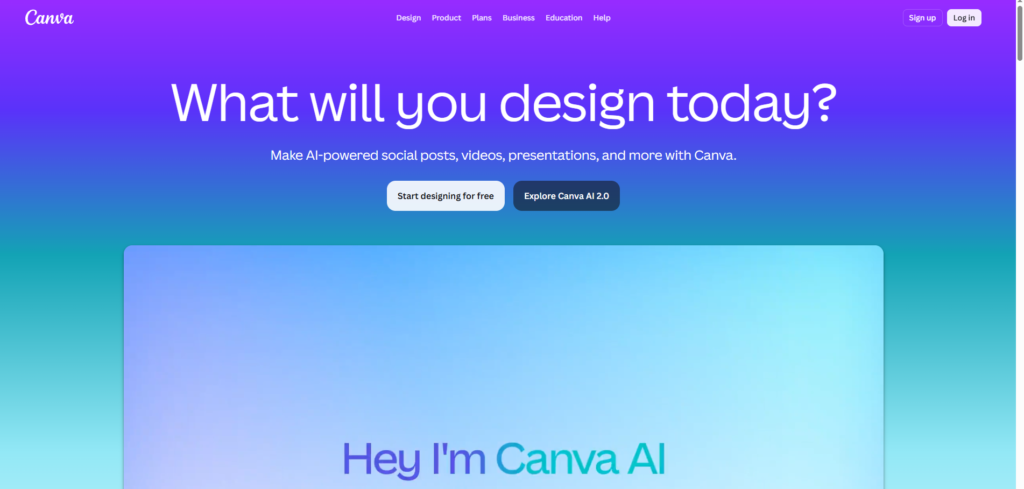
Canva has genuinely disrupted the presentation design space for non-designers. Its drag-and-drop interface, thousands of professionally designed templates, and built-in library of icons, illustrations, and stock photos make it possible to create visually impressive slides without any formal design training. Canva is especially strong for presentations that need personality, color, and creative flair rather than corporate restraint.
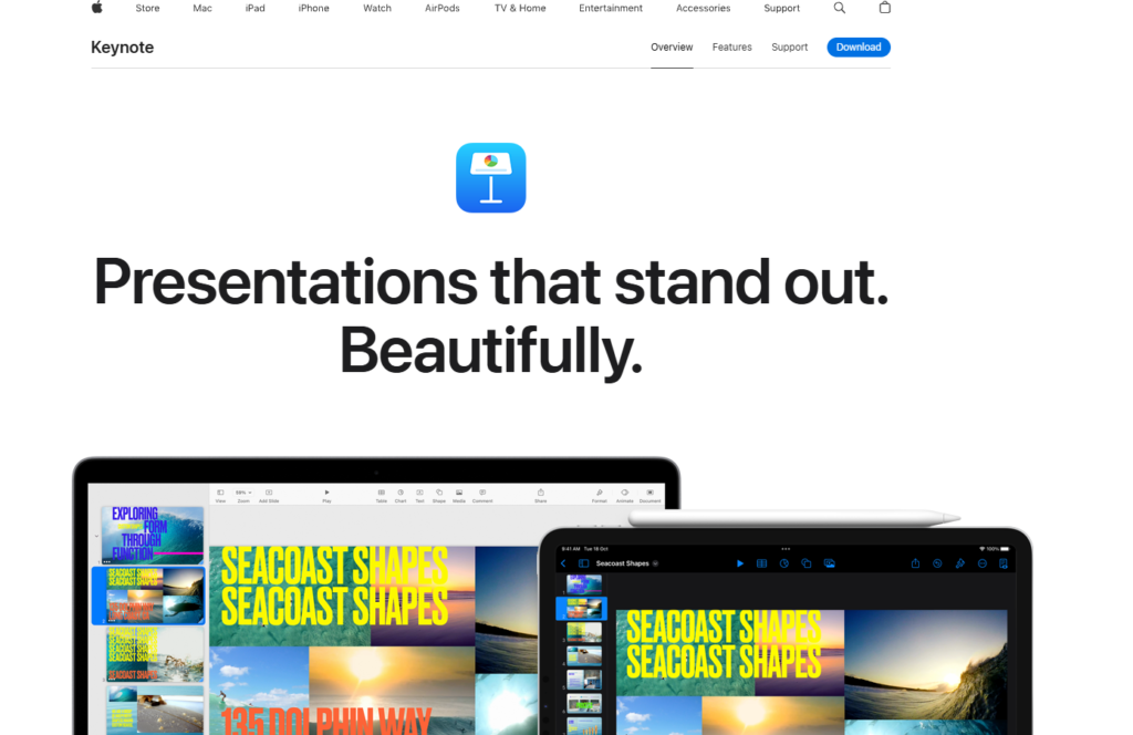
Keynote is Apple’s native presentation software and still sets the benchmark for visual polish among Mac and iOS users. Its animations, transitions, and cinematic effects are smoother and more refined than any competing tool. If you present regularly on Apple hardware and visual elegance matters to your brand, Keynote is worth mastering. The magic move transition alone can make a presentation feel genuinely premium.
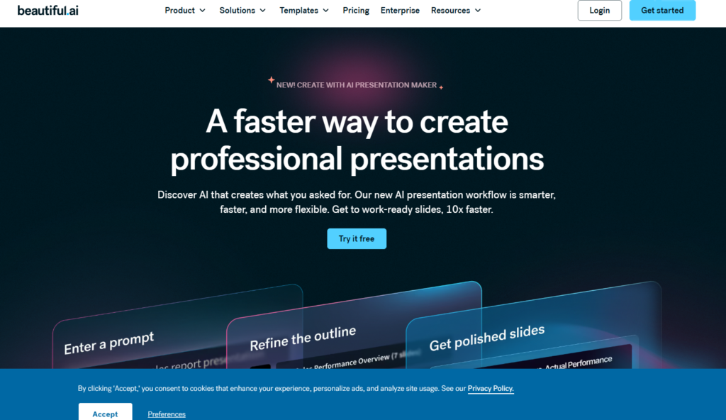
Beautiful.ai is worth mentioning as a newer entrant that uses smart slide templates which automatically adjust layout as you add content. It is particularly useful for people who struggle with layout decisions and want professional results without spending time on manual arrangement.
For Data Visualization
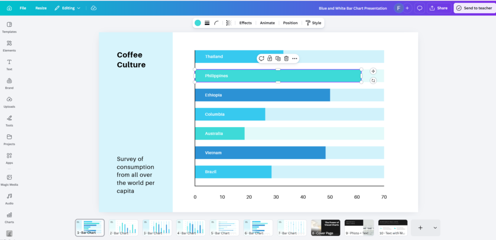
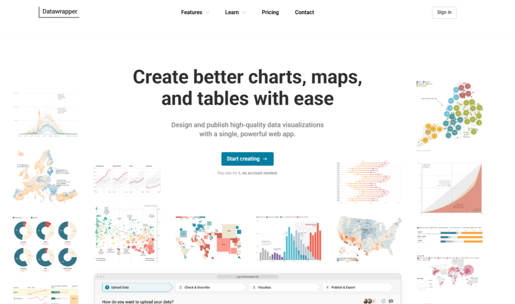
Datawrapper is one of the best tools available for creating clean, accurate, publication-quality charts without any design expertise. It is used by major newsrooms and research organizations precisely because it produces charts that are both visually clear and rigorously accurate. The interface is straightforward — paste your data, choose your chart type, customize colors and labels, and export. It handles bar charts, line charts, maps, and scatter plots particularly well.
Flourish takes data visualization further with more advanced and interactive chart types including animated race charts, story maps, network diagrams, and scrollytelling formats. It is particularly powerful for data-heavy presentations where you want the audience to feel the data rather than just read it. Many of its templates are genuinely stunning straight out of the box.
Infogram sits at the intersection of data visualization and infographic design. It is the strongest choice when you need to combine charts, icons, maps, and text into a single cohesive visual rather than a standalone chart. For reports, dashboards, and visually rich data slides, Infogram gives you more layout flexibility than pure charting tools.
Tableau Public is worth considering if your presentation involves complex datasets or you need to create interactive dashboards that audiences can explore. It has a steeper learning curve than the others but produces some of the most sophisticated data visuals available to non-developers.

For Icons and Illustrations
Flaticon is one of the largest icon libraries available, with millions of icons across thousands of consistent style packs. The key advantage is stylistic consistency — you can filter by style and find matching icons for every concept you need within a single visual language. Both free and premium options are available.
The Noun Project offers a similarly vast library with a slightly more curated and design-forward aesthetic. Its collection leans toward minimal, clean line icons that work particularly well in professional and corporate presentations. The pro subscription gives you access to color icons and removes attribution requirements.
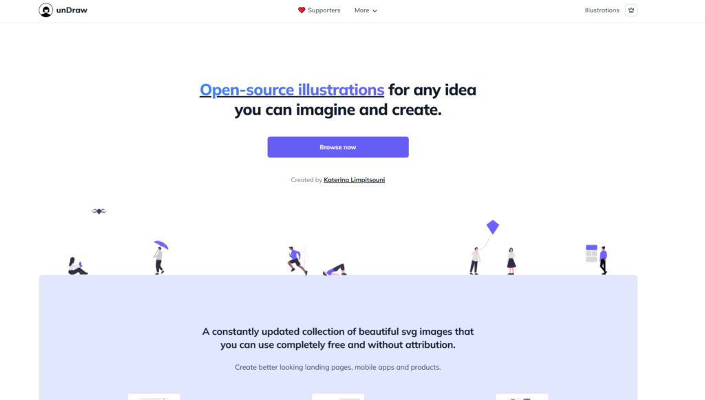
Undraw provides free, open-source illustrations in a consistently clean and modern flat style. Every illustration can be customized to match your brand color with a single hex code change directly on the website. It is one of the most practical free resources available for adding illustration to presentations without hiring a designer.
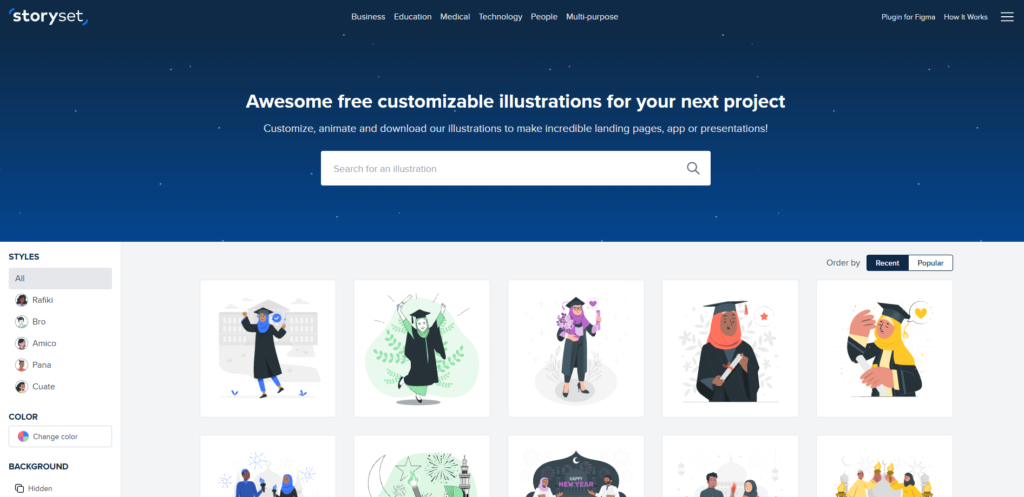
Storyset goes a step further by offering illustrations in multiple styles — including hand-drawn, flat, and isometric — with built-in animation options. If your presentation needs warmth, personality, and visual storytelling rather than corporate minimalism, Storyset is an excellent resource.
Humaaans specializes in customizable human figure illustrations that you can mix and match to create diverse, representative scenes. Particularly useful for presentations involving people, teams, culture, or human-centered topics.

For Photography
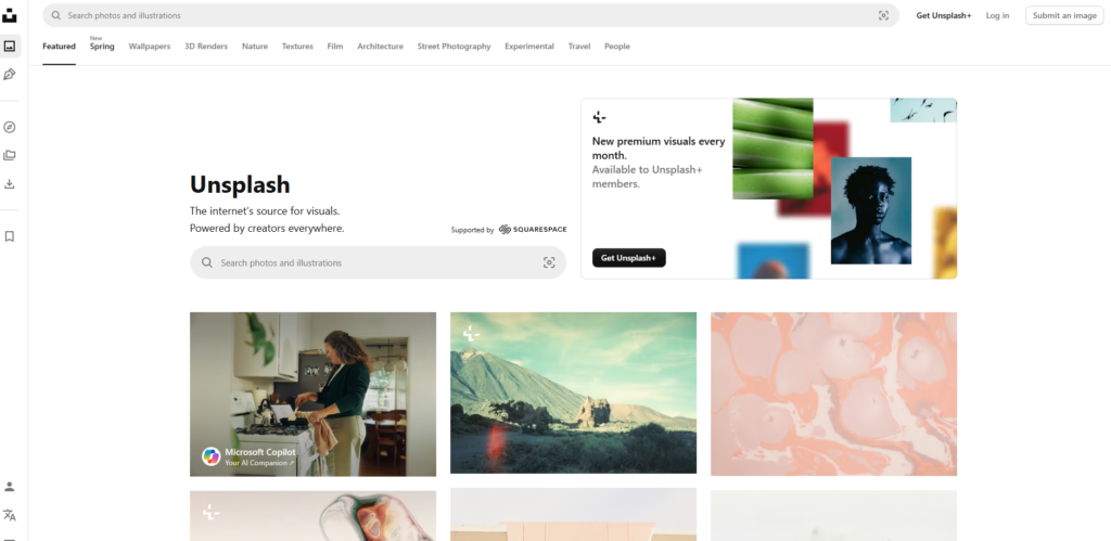
Unsplash remains the gold standard for free high-quality photography for professional use. Its library is curated rather than exhaustive, which means the average quality is genuinely high. Images are free for commercial and personal use without attribution required, making it one of the most practical resources for presentation visuals.
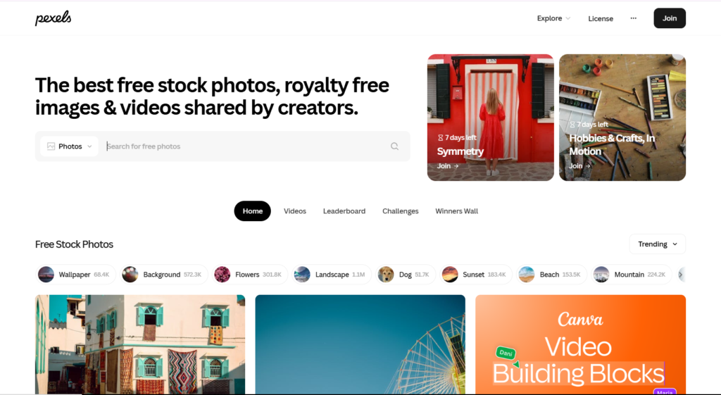
Pexels offers a similarly strong free library with slightly more variety in subject matter, including a broader selection of diverse people and everyday scenes. It also includes free stock video if your presentation tool supports video backgrounds or embedded clips.
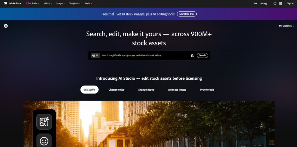
Adobe Stock provides one of the most comprehensive and consistently high-quality paid libraries available. Its integration with PowerPoint, Keynote, and Adobe Creative Cloud tools makes it particularly convenient for professional workflows. Licensing is clear and straightforward for commercial use.
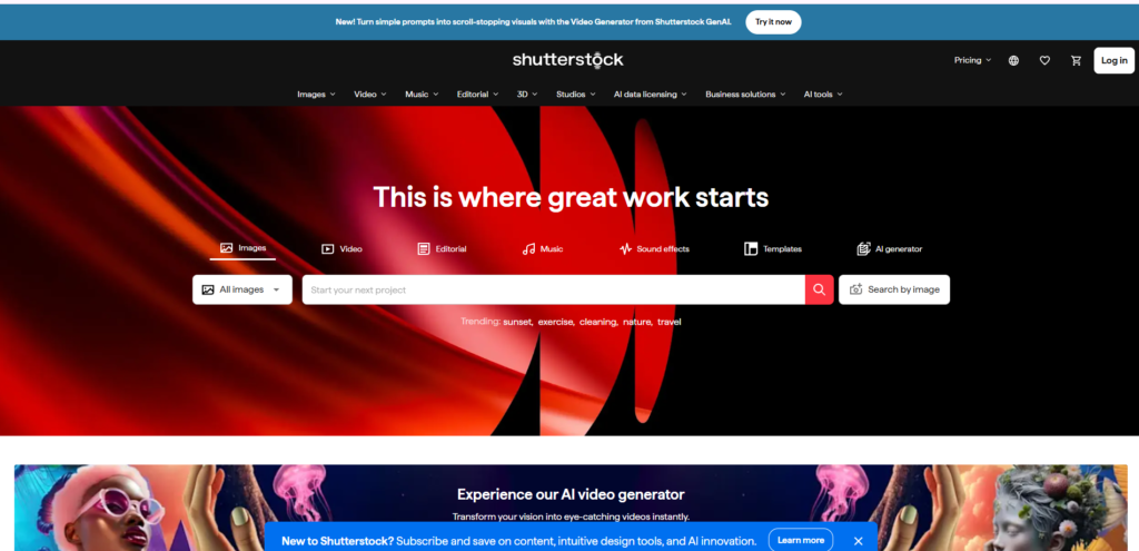
Shutterstock offers a massive catalog with strong search and filtering capabilities. It is particularly useful when you need very specific imagery — niche industries, particular demographics, or highly specific scenarios — that free libraries may not cover adequately.
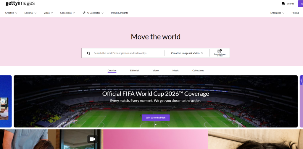
Getty Images is the premium choice for presentations where image quality and exclusivity genuinely matter, such as high-stakes investor pitches, major conference keynotes, or broadcast-quality productions. The licensing costs reflect the caliber of the photography.
Choosing the Right Combination
You do not need every tool on this list. A practical starting stack for most presenters looks like this:
- PowerPoint or Canva for building slides depending on your design confidence
- Datawrapper for any charts or data visualization
- The Noun Project or Flaticon for icons
- Unsplash or Pexels for photography
Master those four categories and you will have everything you need to create presentation visuals that look genuinely professional regardless of your design background.
Common Presentation Visual Mistakes to Avoid
Using too many fonts. Stick to two. Any more creates visual chaos.
Choosing colors randomly. Build a palette intentionally and use it consistently. Random color choices make professional content look amateur.
Copying and pasting charts directly from Excel. Reformatted, cleaned-up charts always look more professional than default spreadsheet exports.
Using clip art or low-quality images. Nothing destroys credibility faster than pixelated images or dated clip art.
Animating everything. Animations should serve a purpose — revealing information at the right moment or showing a process unfolding. When everything flies in from different directions, it becomes distracting noise.
Inconsistent alignment. Misaligned elements make slides look sloppy even when the individual components are well-designed. Use your software’s alignment tools religiously.
Ignoring accessibility. Ensure sufficient color contrast for viewers with visual impairments. Never rely on color alone to convey meaning. Use patterns or labels alongside color in charts.
How to Create Visuals for Different Types of Presentations
Business and Corporate Presentations
Prioritize clarity, professionalism, and data visualization. Keep the color palette conservative and brand-aligned. Let data do the heavy lifting and resist decorative elements that do not add meaning.
Educational and Training Presentations
Use more visual variety to maintain attention over longer sessions. Diagrams, process flows, and illustrative examples work particularly well. Break complex information into visual steps rather than dense explanations.
Sales and Pitch Presentations
Lead with strong visuals that establish credibility and context quickly. Use photography to tell a story and create emotional resonance. Keep text minimal — your words do the selling, not your slides.
Conference and Public Speaking Presentations
Go bolder with your visual choices. Large typography, striking photography, and high-contrast design all work well in large venue settings. Simplify even further than you think necessary — slides need to read clearly from the back of a large room.
Online and Virtual Presentations
Screen-shared presentations need extra attention to contrast and text size. What looks fine on your monitor may be difficult to read on a small shared window. Test your slides at the actual screen size your audience will see them at before presenting.
Final Thoughts
Creating visuals for presentations is a skill that compounds over time. The more deliberately you practice these principles — simplicity, hierarchy, consistency, and intentional use of visual types — the faster and more naturally great design comes to you.
You do not need to be a trained graphic designer to create presentation visuals that impress and engage. You need a clear message, a few solid principles, the right tools, and the discipline to remove everything that does not serve your audience.
Start with your next presentation. Apply one principle you learned here. Then apply another. Within a few decks, you will have a design instinct that makes every presentation you build more powerful than the last.

Abdullah Zulfiqar is Co-founder and Client Success Manager at RankWithLinks, an SEO agency helping businesses grow online. He specializes in client relations and SEO strategy, driving measurable results and maximizing ROI through effective link-building and digital marketing solutions.